

〇 UI Kit
Design System Foundation | UI Kit
Foundations of the SDSC Design System for building data science and research applications.
Based on datascience.ch visual identity.
1. About this UI Kit
This UI Kit establishes the foundational elements of the SDSC design system, providing guidance for developers building digital platforms and applications. It includes design tokens, typography, color palettes, brand assets, core UI components, accessibility guidelines, and layout patterns derived from the Swiss Data Science Center's visual identity, helping ensure consistency and quality across SDSC digital products.
The guidelines provide practical examples, implementation recommendations, and reusable assets to streamline development and support a coherent user experience across projects. Whether you're building a new platform from scratch or enhancing an existing application, this kit provides a consistent visual and implementation framework that aligns with SDSC brand standards while serving as the basis for a broader design system.
2. Design Tokens – Core Components
Foundational design elements and base components
Colors
System color palette with primary colors and their variations for flexible UI design
PRIMARY COLORS
Dark Blue
#26235c
Primary brand color, buttons hover, banners
Light Blue
#5561a6
Primary buttons, links, interactive elements
SECONDARY COLOR
Green
#90ca42
Accent color, highlights, CTAs
NEUTRAL COLORS
Grey
#848484
Labels, secondary text, icons
Light Blue Background
#dddeec
Banners, section backgrounds
Black
#000000
Text, headings, footers
White
#ffffff
Backgrounds, cards, text on dark
Color Variations
Lighter and darker tints for UI flexibility (hover states, borders, backgrounds)
Dark Blue Scale
Lighter
#4a4889
Light
#383673
Base
#26235c
Dark
#1e1c4a
Darker
#161438
Light Blue Scale
Lighter
#8a94c9
Light
#6f7ab8
Base
#5561a6
Dark
#434e85
Darker
#323b64
Green Scale
Lighter
#b8e186
Light
#a4d564
Base
#90ca42
Dark
#73a235
Darker
#567928
GRAYSCALE PALETTE
Neutral grayscale palette for backgrounds, cards, borders, and subtle UI elements
50
100
200
300
400
500
600
700
800
900
Surface Color Usage
- • 50–200: Light backgrounds, subtle borders, disabled states
- • 300–500: Medium grays for dividers, placeholder text, secondary borders
- • 600–900: Dark text, strong borders, overlay backgrounds
SEMANTIC COLORS
Status and feedback colors for interactive states, alerts, and notifications
Success
#10b981
Success states, confirmations, positive actions
Warning
#f59e0b
Warning messages, caution states
Error
#ef4444
Error states, destructive actions, alerts
Info
#3b82f6
Informational messages, help text
Semantic Color Variations
Lighter and darker shades for hover states, backgrounds, and borders
Success Scale
Lighter
#6ee7b7
Light
#34d399
Base
#10b981
Dark
#059669
Darker
#047857
Warning Scale
Lighter
#fcd34d
Light
#fbbf24
Base
#f59e0b
Dark
#d97706
Darker
#b45309
Error Scale
Lighter
#fca5a5
Light
#f87171
Base
#ef4444
Dark
#dc2626
Darker
#b91c1c
Info Scale
Lighter
#93c5fd
Light
#60a5fa
Base
#3b82f6
Dark
#2563eb
Darker
#1d4ed8
Color Usage Guidelines
Primary Usage
- • Dark Blue (#26235c): Button hover states, banner backgrounds, dark sections
- • Light Blue (#5561a6): Primary buttons, hyperlinks, interactive elements
Secondary Usage
- • Green (#90ca42): Accent color, highlights, dividers.
Neutral Colors
- • Grey (#848484): Labels with circle prefix, secondary text, icons
- • Light Blue BG (#dddeec): Section banners, highlighted content areas
- • Black (#000000): Headings, body text, footers
- • White (#ffffff): Card backgrounds, text on dark backgrounds
Usage Notes
- • Hyperlinks: Always use #5561a6 for text links
- • Footers: Always use black (#000000) background
Typography
Dual font system: Space Grotesk for headings, Switzer for body
Primary Fonts
Headings – Space Grotesk
Data-Driven Innovation
Research & Development
Featured Projects
Team & Collaborators
Body Text – Switzer
Enabling data-driven science and innovation for societal impact across Switzerland.
This is the standard body text used for paragraphs and general content throughout the interface.
Secondary information, captions, and metadata
Call to Action
Auxiliary text, timestamps, and helper information
Typography in Context
The Swiss Data Science Center
We bring together expertise from across Switzerland to enable cutting-edge research and development in data science and artificial intelligence.
Through collaboration with academic institutions and industry partners, we develop innovative solutions that address real-world challenges.
Typography Guidelines
Font Usage
- • Use Space Grotesk for all headings (H1–H6)
- • Use Switzer for body text, buttons, forms, and UI elements
- • Maintain font consistency across the application
- • Load both fonts for complete design system
Best Practices
- • Line Height: 1.5–1.6 for body text, 1.2–1.3 for headings
- • Letter Spacing: Tight (–0.02em) for large headings
- • Font Smoothing: Antialiased for crisp rendering
- • Max line length: 65–75 characters for readability
Content Hierarchy & Labels
Typographic hierarchy and structured content labeling system
TYPOGRAPHIC HIERARCHY
PAGE TITLE
Enabling data-driven science & innovation
48px / Space Grotesk Bold / #000000
SECTION TITLE
The Swiss Data Science Center
32px / Space Grotesk Bold / #000000
SUBSECTION TITLE
Research & Development Projects
24px / Space Grotesk Semibold / #000000
BODY TEXT
This is the standard body text used throughout the interface. It should be clear, readable, and maintain adequate line height. Text can include hyperlinks in blue (#5561a6) for navigation.
16px / Switzer Regular / #000000 • Links: #5561a6
SECONDARY TEXT
Secondary information, captions, metadata, and supporting text
14px / Switzer Regular / #848484
CONTENT LABEL PATTERN
Structured content sections use a three-level hierarchy: Label → Title → Body
ABOUT
The Swiss Data Science Center
We bring together expertise from across Switzerland to enable cutting-edge research and development in data science and artificial intelligence.
SERVICES
What We Offer
From research collaboration to training programs, we provide comprehensive support for data-driven innovation across multiple sectors.
CONTACT
Get In Touch
Have questions about our programs or want to explore collaboration opportunities?
Content Label Pattern Structure
Label with Circle Prefix
〇 + LABEL TEXT in grey (#848484), uppercase, Switzer Medium, 14px.
Section Title
Space Grotesk Bold, 32px, black (#000000)
Body Content
Switzer Regular, 16px, black (#000000) with hyperlinks in #5561a6
Spacing Guidelines
- • Label to Title: 12px (0.75rem)
- • Title to Body: 16px (1rem)
- • Between Sections: 48–64px (3–4rem)
- • Line Height Body Text: 1.6 (25.6px for 16px text)
- • Line Height Headings: 1.2–1.3
Logo Guidelines
Official logo and brand identity guidelines
Every logo in all formats — PNG, SVG, JPG and print-ready EPS, in colour, white and greyscale.
Short version (primary logo)
The short version is the preferred and primary logo. It should be used whenever space allows, as it best represents the SDSC brand in a clear and recognisable way.




Compact version (alternative option)
The compact version is the recommended alternative when horizontal or vertical space is limited. Use it in UI components, toolbars, small headers, or situations where the short version would feel visually crowded.

Symbol only (icon mark)
The symbol on its own is reserved for small spaces and contexts where the brand is already established — favicons, app icons, avatars, or a decorative mark. Use the short or long version wherever the name needs to be legible.




Long version (full logo)
The long version is the most complete expression of the logo and should be used in contexts where full brand presentation is important and space is not restricted.


Clear Space & Sizing

Maintain clear space of X (height of logo) around all sides
Logo Usage Guidelines
Do
- • Use official logo files provided
- • Maintain aspect ratio when scaling
- • Ensure adequate clear space around logo
- • Use color logo on white/light backgrounds, white logo on dark backgrounds
- • Minimum size: 32px height for digital
Don't
- • Don't stretch or distort the logo
- • Don't change logo colors arbitrarily
- • Don't add effects (shadows, gradients, outlines)
- • Don't place on busy backgrounds
- • Don't use outdated logo versions
Project Partner Logos
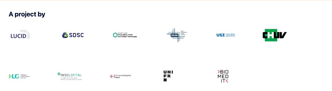
If the application is a collaborative project, display partner logos in the footer section in equal size on one line next to each other.
Some examples from the projects Lucid and Imaging Plaza

General Partner Logo Guidelines
- • Footer Requirement: Always display all 4 main partner logos (ETH Zürich, EPFL, PSI, Biopôle) in the footer
- • On Light Backgrounds: Use original colored versions of partner logos
- • On Dark Backgrounds: Ensure all logos are shown in a light color
- • Size: Ensure all partner logos appear the same visual size
- • Spacing: Maintain 48px (3rem) gap between partner logos
Dot Pattern Background
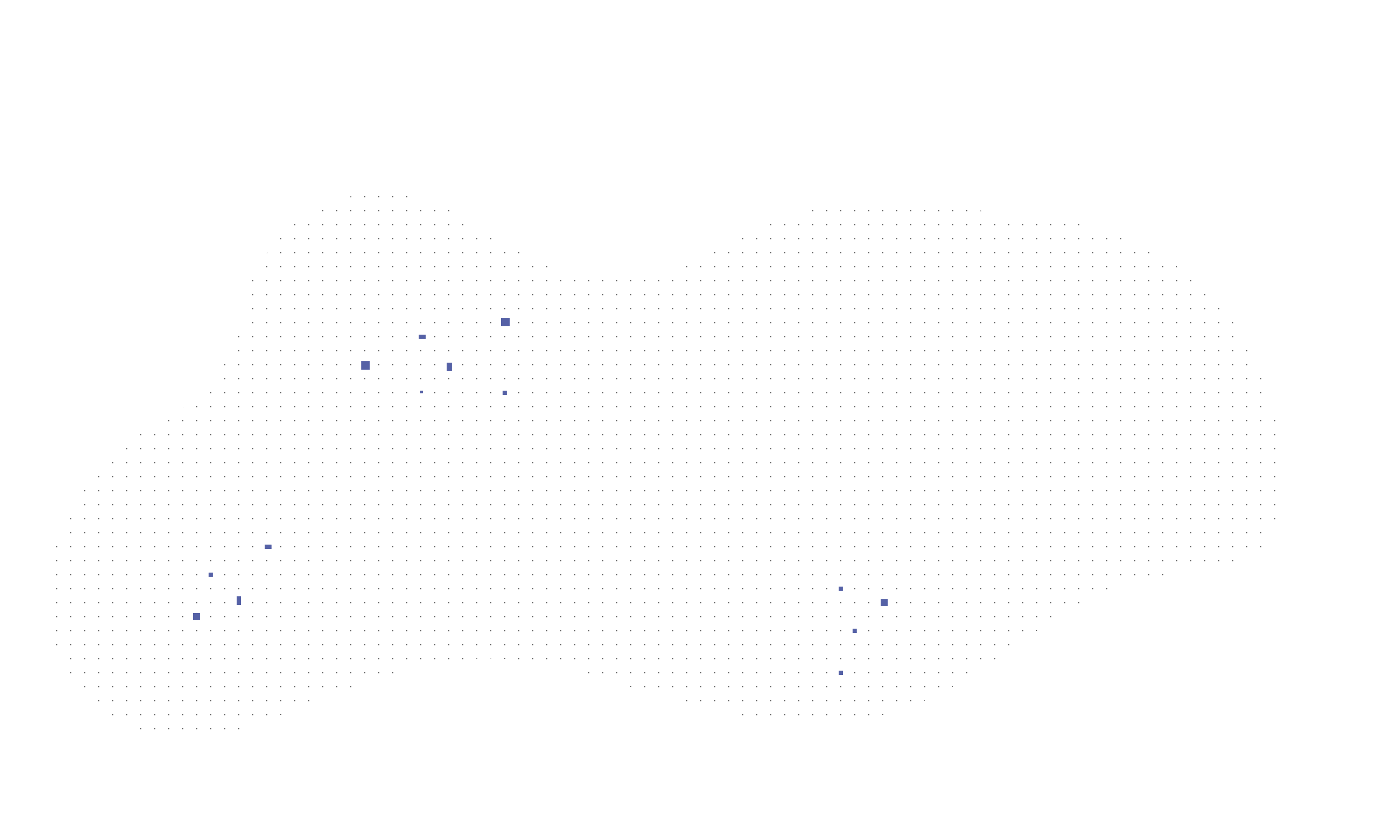
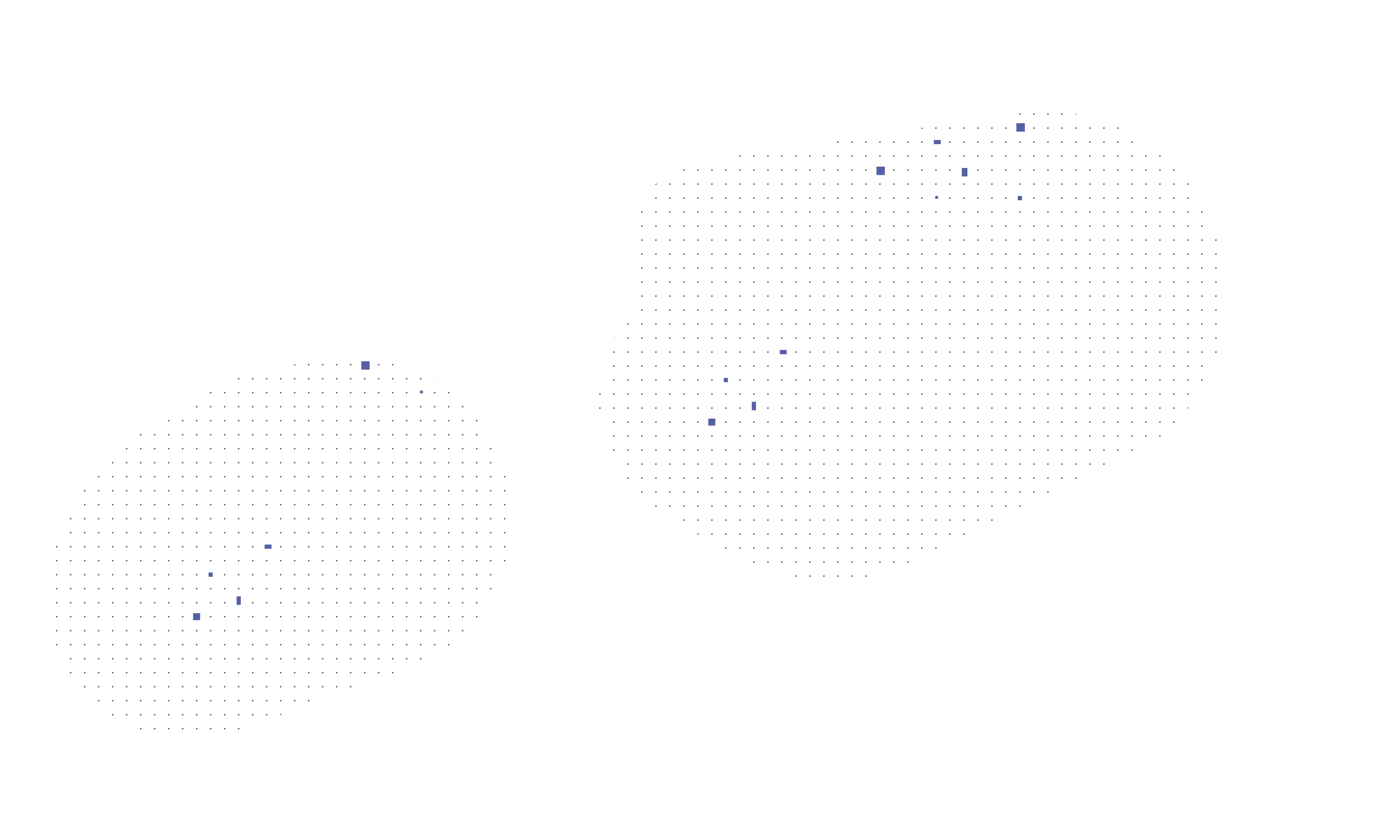
Subtle dot pattern for hero sections and key content areas. Pattern positioned from left or right edge.
LOREM IPSUM
Lorem Ipsum Dolor Sit
Lorem ipsum dolor sit amet, consectetur adipiscing elit, sed do eiusmod tempor incididunt.
Pattern shown above with content overlay
Pattern Variations & Downloads




Pattern Usage Guidelines
Best Uses
- • Hero sections with primary messaging
- • Featured content areas
- • Call-to-action sections
- • Background for cards with important content
- • Landing page headers
Avoid
- • Using on small text-heavy sections
- • Combining with busy images or complex layouts
- • Applying to entire pages (use sparingly)
- • Layering multiple patterns
- • Using without sufficient content overlay contrast
Implementation Notes
- • Pattern Files: Available in 3 variations, each as a scalable SVG and a PNG (download via the buttons above)
- • Background Size: Use
background-size: coverfor consistent scaling - • Background Position: Use
left centerorright centerinstead ofcenter - • Content Overlay: Use white or semi-transparent backgrounds for content readability
- • Contrast: Ensure text maintains WCAG AA contrast ratios when placed over the pattern
Iconography
SDSC uses Lucide as its icon library — a clean, consistent, open-source set whose stroked, geometric style pairs well with Space Grotesk and Switzer.
Installation & Usage
Install the package for your framework, then import icons by name as components.
npm i lucide-svelte

<script>
  import { Search } from 'lucide-svelte';
</script>

<Search size={20} strokeWidth={2} />npm i lucide-react
import { Search } from 'lucide-react';
<Search size={20} strokeWidth={2} />COMMON ICONS
Click any icon to copy its import statement
SIZING
Use a consistent set of sizes aligned to the 8px spacing scale. 16px for inline/dense UI, 20px default, 24px for emphasis, 32px+ for feature icons.
COLOR
Icons inherit currentColor by default. Use brand and semantic colors for their defined roles — Dark Blue / Light Blue for primary, Grey for secondary, semantic colors for status.
STROKE WIDTH
Keep a uniform stroke width across an interface. 2px (default) is recommended; 1.5px reads lighter at large sizes.
ICONS IN CONTEXT
Icon Guidelines
Do
- • Use Lucide for all interface icons
- • Keep a single stroke width across the UI (2px default)
- • Size icons on the 8px scale (16 / 20 / 24 / 32px)
- • Let icons inherit text color via
currentColor - • Pair icons with text labels wherever possible
- • Add
aria-labelto icon-only buttons; mark decorative iconsaria-hidden
Don't
- • Don't mix multiple icon libraries in one product
- • Don't mix filled and stroked icon styles
- • Don't use arbitrary off-brand colors for icons
- • Don't rely on an icon alone to convey critical meaning
- • Don't scale icons to non-standard, inconsistent sizes
3. Basic Components
Interactive UI elements including buttons, form inputs, checkboxes, toggles and progress indicators
Form Inputs
Standard text inputs, textareas, and select dropdowns
Text Input
Textarea
Select Dropdown
Checkboxes
Standard checkbox components with different states
Toggle Switches
Toggle switches for binary on/off states
Progress Indicators
Progress bars and loading indicators
Progress Bars
Loading Spinner
4. Page Layout Possibilities
Common page compositions and layout patterns
HERO SECTION: IMAGE + CONTENT
Two-column layout with image and content, commonly used for landing pages
LOREM IPSUM
Lorem Ipsum Dolor Sit Amet Consectetur
Lorem ipsum dolor sit amet, consectetur adipiscing elit. Sed do eiusmod tempor incididunt ut labore et dolore magna aliqua.
FEATURE GRID: 2-COLUMN
Two-column grid for detailed feature showcases or side-by-side comparisons
Lorem Ipsum Dolor
Lorem ipsum dolor sit amet, consectetur adipiscing elit, sed do eiusmod tempor incididunt ut labore et dolore magna aliqua.
Sit Amet Consectetur
Ut enim ad minim veniam, quis nostrud exercitation ullamco laboris nisi ut aliquip ex ea commodo consequat.
FEATURE GRID: 3-COLUMN
Three-column grid layout for showcasing features, services, or content categories
Lorem Ipsum
Sed do eiusmod tempor incididunt ut labore
Dolor Sit
Ut enim ad minim veniam quis nostrud
Amet Consectetur
Duis aute irure dolor in reprehenderit
FEATURE GRID: 4-COLUMN
Four-column grid for compact feature showcases or icon-based services
Lorem
Dolor sit amet
Ipsum
Consectetur
Adipiscing
Elit sed do
Eiusmod
Tempor incididunt
KEY NUMBERS
Highlight important statistics, metrics, or achievements with large numbers
Lorem Ipsum Dolor
Lorem Ipsum
Dolor Sit
Amet Consectetur
Adipiscing Elit
LIST LAYOUT
Structured lists for displaying steps, features, or sequential information
Lorem Ipsum Dolor
Lorem ipsum dolor sit amet, consectetur adipiscing elit
Sed do eiusmod tempor incididunt ut labore et dolore
Ut enim ad minim veniam, quis nostrud exercitation
Duis aute irure dolor in reprehenderit in voluptate
Dolor Sit Amet
Lorem ipsum dolor sit amet consectetur adipiscing elit
Sed do eiusmod tempor incididunt ut labore
Ut enim ad minim veniam quis nostrud
Duis aute irure dolor in reprehenderit
EVENT INDEX
Chronological event listing with dates, titles, and metadata
Lorem Ipsum Dolor Sit Amet Workshop
Lorem ipsum dolor sit amet, consectetur adipiscing elit, sed do eiusmod tempor incididunt ut labore et dolore magna aliqua.
Consectetur Adipiscing Elit Conference
Sed do eiusmod tempor incididunt ut labore et dolore magna aliqua. Ut enim ad minim veniam, quis nostrud exercitation.
Sed Do Eiusmod Tempor Symposium
Duis aute irure dolor in reprehenderit in voluptate velit esse cillum dolore eu fugiat nulla pariatur.
ARTICLE GRID
Three-column grid layout for articles, blog posts, or news items
Lorem Ipsum Dolor Sit Amet
Lorem ipsum dolor sit amet, consectetur adipiscing elit, sed do eiusmod tempor incididunt.
Read MoreConsectetur Adipiscing Elit
Sed do eiusmod tempor incididunt ut labore et dolore magna aliqua ut enim ad minim.
Read MoreUt Enim Ad Minim Veniam
Quis nostrud exercitation ullamco laboris nisi ut aliquip ex ea commodo consequat.
Read More